Pages

Thursday, June 30, 2011

Summertime Scavenger Hunt–1st instalment

Rinda set us a varied and challenging list of subject to photograph this summer and I managed to snap three easy ones yesterday when I went into the centre of Edinburgh.

item 2 a museum – I love the warm sandstone on this building

rinda-museum

item 8 – your country’s flag – both the Scottish flag and Union Jack (United Kingdom flag) fly over the court buildings

rinda-flags


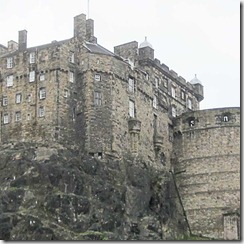
item 14 – a castle – handy that there is one of these in the middle of the city!

rinda-castl;e

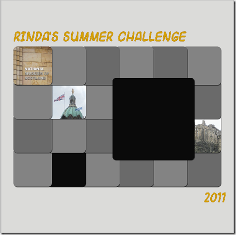
I’ve decided I will put all 21 together in one collage – yes I am confident I will think of a way to capture them all.  i looked through my template folder and found one by Wanda at StarXL8 that fits 21.  For now I am just adding photos – in the order on the list.

rinda layout 1

Hope to have another update next week.

Wednesday, June 29, 2011

stand out

I’m really enjoying the Summer of Colour Challenge at Twinkle Twinkle because of the great range of media that people are using and because of my own reactions to using only one colour range, including those that I tend to shy away from.  I am using the challenge to play with Photoshop Elements to make interesting canvases for some of the my favourite Dr Seuss quotes.

seuss-pink

I used the gradient tool and some brushes to create the background and flat dots.  The raised dots use the bevel layer style.  Nothing particularly flash technique wise but I think it is powerful as a piece.

If you are interested in trying some digiart techniques on Photoshop Elements then you might be interested in the new hour long one on one buddy session covering three techniques for creating digiart backgrounds that  I’m offering on DigiScrap Buddy.

Tuesday, June 28, 2011

experimenting again

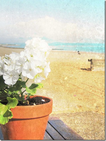
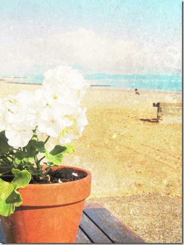
I’ve noticed in the texture Tuesday posts that I visit and in my own texturising work that there are often bits of the photo where we want to remove the texture and people use different techniques to do this.  In this example the image on the right is fully textured and on the left I removed some from the left hand side and I think it gives the image much more depth. I used Kim Klassen’s golden texture on hard light blending mode
 texture-with-gradient-smalltexture-with-flowrs-without
In the past I usually used a brush tip in the eraser tool at 50% opacity to remove some of the texture but it is a bit hit and miss.  I’ve been playing with the gradient tool recently and decided to try using it as a way to remove part of the texture. 

The rest of the post describes how I did this – for those of you not interested in PSE techniques feel free to skip the rest of the post.

Instead of removing some of the texture, I added back a small part of the original photo and did this by clipping a copy of the photo onto a gradient level that is mostly transparent.  It is easier to do it and look at the result than think about how it works just reading this.

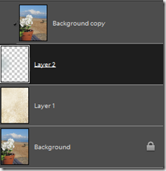
Here is the layer panel for the image on the left
layers panel gradient portobello
I added the texture in soft light blending mode.

Then I created a new layer and used the gradient tool, set on foreground to transparent, with the circle shape and ticked reverse.  I drew a line from the left edge to the middle of the flowers because that was the area that I wanted to remove the gradient. 

I duplicated the original, moved it to the layer above the gradient and then clipped it to the gradient level – only the portion that is grey in the gradient shows.

The same technique worked nicely on a portrait of my nephew too.

This time I added golden texture in soft blend to make the face softer.  But I wanted to distort the background more so I added golden texture again on hard light.  I then removed hard light from the face using the a gradient level (set on diamond) and clipping to it a copy of the photo with just the first texture layer added.

I will be playing with this technique some more as I think it has lots of potential.

Monday, June 27, 2011

flowers are not the only yellow in my garden

yellow

I love my bright garden chairs (the other 2 are purple and turquoise) and it would be lovely if we had some better weather so I could sit in them instead of just looking at them from my kitchen window.

Really enjoying the diversity of prompts in Crazy days of summer. Check out the other interpretations.  They have just announced the prompts for July and again great variety – light next week and then patriotism – already got me thinking.

Sunday, June 26, 2011

a photo a day for the scavenger hunt

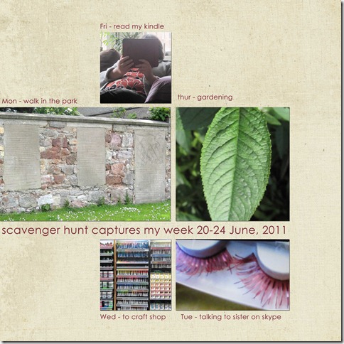
I was looking at the photos that I had taken for the Sunday scavenger hunt this week and realised that I had taken one a day, Monday to Friday and that they were a nice overview of my week.  So I put them together in a digital scrapbook layout, for a change, using a template from Cathy Z’s Design Your Life class.

scavenger-hunt

The categories were

windows and doors – walking in the park I’ve often wondered why these have been blocked off

eyelashes – I knew my sister had some stunning falsies so I asked her when we were Skyping and then took a photo of the screen as she showed me

paint – I rarely buy it but I love the range available in types of paint and colours

veins on a leaf – plenty in the garden

faceless portrait – loving my new kindle

If you are interested in creating a digital scrapbook page using PhotoShop Elements but want some personal help then have a look at my new one on one buddy session (via skype). to create a scrapbook page or enhance photos

Friday, June 24, 2011

I’ve never been a great painter

but now I have Photoshop to do it for me !!!! 

ia-summer-sun-2

IA-summer-sun-1

These started as photos that I had taken and then I used some of the artistic styles in the filter menu in PSE.  I kept tryign different ones until I liked the result.

Prompted to play by the Inspiration Avenue prompt this week to be creative with summer sunshine.  We haven’t had much of that around here this month so I used photos from last year.

interested in exploring creativity in Photoshop Elements then check out the digiart intro in DigiScrap Buddy

Thursday, June 23, 2011

feels so good to grow my lunch

veggie-garden

prompted by the Simple Aussie Girls 1st simple scrap challenge template, to tell a simple story of my week.

I used the eyedropper tool to take all of the colours for the layout from the photos, including changing the colour of the stitching to match the strawberry, and date. 

I turned the template into a 12 x 12 using resize canvas on the image menu and added the strip on the left.

Thanks to the simple Aussie girls for showcasing simple layouts and providing the versatile template.

If you want some easy to follow instructions on using PhotoShop Elements to create simple layouts check out DigiScrap Buddy.

Wednesday, June 22, 2011

sometimes the answers are simple

seuss-green
Continuing the summer of colour challenge at Twinkle, Twinkle with more digiart and another favourite quote from Dr Seuss – you can see my first piece in the series here.

This week the colour challenge was green with a bonus challenge to add some citron. I’m enjoying these challenges and restricting myself to using only the colours in the challenge.


I'm doing all of my pieces using Photoshop Elements to create digital artpieces. I want to try using different tools and techniques each week in this challenge.  This piece started with some photos I took of atolls from a plane window flying over New Caledonia.  I then used the gradient tool to add layers of green and also the citron.  I used the dissolve blending mode to create the spattered effect.  The font is myriad.

Tuesday, June 21, 2011

using my Grandfather’s photos

grandpa-in-old-book

I created this page as if it was from my Grandfather's photo album – he is paddling in both photos.  I love the hats they are wearing to paddle.

I used an oldbook background from ShadowHouse Creation, photo corners from Heaters Scraps and the travelling typewriter font.

The scans that I have of the two photos were in different types of black and white so I added texture to both to make them look the same.  First I used Kim Klassen’s linen on multiply blending mode (40% opacity) and then her portrait texture on soft light blending mode.  I applied the same textures to the labels to give them the same aged look.

I’m pleased with this approach and will use it for some more of the old family photos that I have.

Check out Kim Klassen’s site for more textures applied to photos of people (not a common content for texturising).

Monday, June 20, 2011

crazy days of summer - water

I walk by the river most days and by the beach at least once a week.  So the third weekly prompt at Crazy Days of Summer – water – was a case of ‘which picture to use’ rather than ‘what can I photograph?’. Sunday last week there was lovely sunshine of the water and clear views (there is often fog and the other side disappears).

I chose this as my water shot for the Crazy Days of Summer collection.  It is straight out of camera.

alicia-water

Looking at the other photos I took that day I was inspired to create a layout using a lovely versatile template from Paislee Press (see here for a very different page I made with the template).

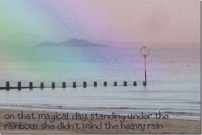
PORTOBELLO-BEACH

Font is matisse and I applied a down bevel layer style to the template doodle to make the lines look as if they were drawn into the background.

Saturday, June 18, 2011

June colour combo bloghop

Welcome to the Color Combo Blog Hop!

If you arrived from Alysse’s photographs welcome to my step on the hop.  If you are a regular reader then you can see the full list for the hop at the end of this post.  

Through the hop you will see a range of creativity, with the colour combo as the common theme.  I decided on a layout using more photos from our trip last week

colour-bloghop-june

colour bloghop june words

The template is by Kate Pertiett; the font is Myriad. 

Your next stop on the hop is Rebekah – I know she will have a fabulous piece with the colour combo. 


Here is the full list for the blog hop – enjoy your trip

http://amysoto.blogspot.com/

http://alyssephotographs.blogspot.com/

http://helenascreativemaven.blogspot.com/    YOU ARE HERE

http://istampscrapcraft.blogspot.com/

http:/handmadebykirsty.blogspot.com

http://www.vsws.typepad.com/

http://adriennefalzon.blogspot.com/

http://www.scrapworthylives.com/http://spud-pickle.blogspot.com/

http://www.curlyscrapbooker.blogspot.com/

http://sugarandscrap.blogspot.com/

http://digipage-blog.everything-digital-scrapbooking.com/

http://1200somemiles.blogspot.com/

http://www.MichelleRoycroft.blogspot.com/

http://craftygoodies.blogspot.com/

http://scrapyourlife.net/

http://www.snapsandsnippets.blogspot.com/

http://scribblesstickingstitchingstroking.blogspot.com/

Friday, June 17, 2011

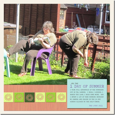
on the 1 day of summer

on-the-day-of-summer

day os sumemr text

I collect sketches and templates, lots of them, I admit.  Many in my collection I have not used and a few I have used many times.

On Wednesday when I opened Shimelle’s sketch of the week post and saw this sketch I was inspired to create a page right then – this sketch clicked for me and I had a photo and a story that I wanted to scrap. Usually a ‘what we did this summer’ need lots and lots of photos but we have had only one really sunny day so far so I liked the idea of a one photo layout for this story.

I’m sure I’ll use this sketch again – space for a story, prominence for a picture, and a small spot for some pretty if I feel like it but it would work without too. I stuck closely to the sketch because it all worked for me on this story / scrapping session.

I created the multi person photo using the eraser on PSE. All ‘papers’ are created on PSE using the colour picker tool to take colours from the photo.  The flower on the squares is a brush from sleepwalkerfish that I used as an eraser (like a punch).  The font is travelling typewriter.  The idea of copying the text at larger size comes from simple Aussie girls.

Thursday, June 16, 2011

creating a composite photo digitally

Last week I posted a composite photo I made from 8 photos of a lovely waterfall

This is another version of that waterfall

waterfall-collage-1b

Several people in the comments said that they like the composite but did not know how to make one digitally.

So

I created a tutorial for DigiScrap Buddyfind out how to create a composite photo digitally here.

I’d love to see any composites that you make, if you post one please leave a  comment here.

Here is another composite – a long panorama of Queen’s View

queens-view-collage

Wednesday, June 15, 2011

playing in blue

SEUSS-BLUE

I’ve been on the lookout in blogland for a challenge where I can play with some of the digiart or collage aspects of photoshop elements to make a book of prints containing some of my favourite Dr Seuss quotes. The new 10 week summer colour challenge for works in any medium, being run by Kirstin on Twinkle, Twinkle, seemed ideal. 

As you can see, first up was blue.

I used the gradient tool; filter texturize, erasing with grunge brushes, impressionist brush and the bevel layer style.

The font is Boring showers and I added bevel layer style

I bevelled the whole image (move the flattened image onto a new blank file and then apply bevel to the image – works for a drop shadow too).

I think I will print the 10 pieces, glue pairs back to back, punch two holes and add jump rings to make a small book.

Tuesday, June 14, 2011

postcards from Pitlochry

some more of the lovely scenery from our short road trip last week around Pitlochry, Perthshire.  With all the rivers and lochs there were plenty of opportunities for sweeping landscapes.


queen's-view

Although Queen Victoria did visit this site it is believed the spot was named for the much earlier Queen Isabella, wife of Robert the Bruce (1306-1329).

river-pitlochry

I took this photo from they hydro dam just next to the Pitlochry theatre where we saw a fabulous performance of My Fair Lady.

I applied Kim Klassen textures to both of them - START on Colour Burn and then Luminous on Overlay, both on 70%.

For the captions I used the Antipasto font and created the engraved effect using the bevel layer style – you can follow the instructions for engraved titles here.

Check out Kim’s Texture Tuesday for more lovely texture work.

Sunday, June 12, 2011

peeks of my week

I’ve been trying to complete the photo scavenger hunt with things I am doing during the week and not stage any.  I think the challenges are getting harder – but then it is a challenge.  The first one, long exposure, is hard with a point and click but after several attempts finally worked out a way to make it work.

shs-june-12-long-exp

Long exposure – starting a new shape on my zentangle page.  I enjoy these doodles and have been learning more patterns each week to add to my repertoire. 

kite-3

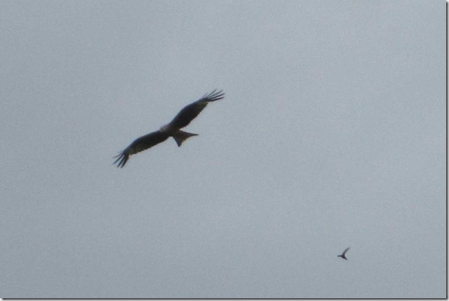
Shape – last week we went to see the red kites, a bird that used to be native in Scotland but was shot out of existence and has now been re-introduced.  The curve of the tail and fingered ends to the wings are their distinctive shape.

shs-june-12-green

Green – on our walk to the waterfall (in my last post) we walked along through beech trees and Douglas firs – I loved the contrasting greens of the two trees.

shs-june-12-fruit

Fruit – I will have a good crop from the strawberry plants I put in my garden this year

shs-june-12-memories

Childhood memories – Yesterday I went to the Leith festival gala day which has lots of performances and stalls from local groups.  We used to go to several local fairs when I was a child.  Yesterday it rained all day but this did not deter the stall holders or the visitors – and I remember going to fairs in the rain as a child too so a double memory.

To see how others interpreted the five items in the scavenger hunt, check here.

Friday, June 10, 2011

refreshing stop on tour of Perthshire

I spent the first three days of this week on a short driving tour with my parents – based in Pitlochry in Perthshire.  Lots of amazing scenery and we were not deterred by the rain showers.

One stop was at The Hermitage on the River Baan for a lovely walk under very tall fir trees to this waterfall

waterfall-1

I took 8 photos with the intention of then creating a composite – something I had done several times in the old days of printed photos.  I found the digital process harder than the printed one because of the ability to change the size of photos but I needed to change all of them by the same amount.

waterfall-collage-3

I like that I can see that this is made up of several photos – I created a version where I blended the edges but preferred this version. have you created any digital composite photos and did you blend the edges?

This is my image for the Crazy Days of Summer weekly challenge – this week the theme is refreshing and I think this fits the bill nicely.  Check out how others have interpreted the theme over the next few days on Alicia’s blog

summerbuttonfinal200x200

Next week the theme is water – as I take several photos of the river and the sea each week I think my problem will be in deciding which few to choose.

Monday, June 6, 2011

Passing the book to ….


Stacey aka ComfyMum writer of Havoc and Mayhem and photographer of dinos and stormtroopers.

thanks for all the great comments on my pieces inspired by this book.

crazy days of summer photo meme–flowers

I’ve been enjoying following photo challenges and have decided to follow along with Alicia’s weekly photo prompt in Crazy Days of Summer

summerbuttonfinal200x200

First prompt was flowers and I took advantage of the one day of summer sun we have had so far to take photos in my garden – beats weeding!  I had fun using the macro setting and concentrating on the vibrant colours of the blooms.  Here are my five favourites

flowers-comb

Next weeks meme is ‘refreshing’ – why not join in?

Sunday, June 5, 2011

let me tell you a story

We have a family tradition of birthday flowers – each of the women in the family has a special flower which we are given by our Dad on our birthday.  My Gramp started it with my Mum – her birthday is in April so her flower is daffodils which are usually in abundance at that time of year.

birthday-flower-daffs

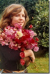
My sister’s birthday is in July and here flower is sweatpea which my Dad also grows in abundance.  This photo was taken about 30 years ago

birthday-flower-sweatpea

My birthday is in May and my flower is Lilly of the Valley. 

birthday-flower-lv-1

There were plenty growing in the garden of the house where my parents lived when I was born.  But since then we have not been able to grow them in abundance.  So imagine my delight and surprise when I noticed that there was a big patch of lily of the valley coming up in the garden of my new house – planted by the previous owner.

  birthday-flower-lv-2

I take it as a sign that I chose the right house to buy.

Sian has been encouraging us to tell a story on the first Sunday of each month – pop over there to check out her story and the links to other stories.

And a last reminder on one of Sian's other great schemes - Pass the Book - if you want to be in the pool for Romancing the Ordinary leave a comment on my post from last Monday - I will draw on Monday 6th (UK time)

Friday, June 3, 2011

love rainbows

When I was a child one of the things I liked to do with colouring pencils was create a rainbow or sunset behind a printed silhouette.  So when I saw the Inspiration Avenue challenge for this week was ‘over the rainbow’ I had to play.

rainbow-1

If only rainbows were this big !!

rainbow-2

The technical stuff for those who want to know

I created the rainbows using the gradient tool in Photoshop elements and then used the eraser tool to remove part of the rainbow to fit the photo.  In the second one the gradient is applied in the diamond shape and I used the dissolve blending mode to give the speckled effect.

Thursday, June 2, 2011

Embracing the sense of taste

In romancing the Ordinary, Sarah Ban Breathnach encourages us to notice and embrace all of our senses.
Last week I was thinking about this as I was cooking dinner and about easy ways to incorporate the ideas into daily life. I got to thinking about the added pleasure from a meal when I add the right sauce or dressing. There are several that I know I like but often don’t go and find them in my recipe books once I have started cooking.

So I was thinking if I noted down a few and had them to hand in the kitchen then I would use them and thus have some plausible pleasures to hand.

So I turned to my scrapping supplies and decided that a business card page protector that I could attach to my fridge would work well – the plastic is practical and the 10 slots are the right size. I could have created a template in PSE or Word and typed up the cards. But I decided to handwrite on card as I thought of the recipes I wanted. When I left my last job I kept several boxes of business cards because I find the plain backs very useful for crafting projects. The cards were great for this project as they are already the right size for the pockets. I decorated each with finds from my small bits of card collection and a strip of washi tape on each for continuity.
pass-the-book-taste

Here is one of the recipes which originated from Nigella’s Express by Nigella Lawson.  Caper sauce – she pours over green veg but I like it over root veg too – melt 75g butter then stir in 2 teaspoons of Dijon mustard and 1 tablespoon of lemon juice and 1 tablespoon of capers – then pour over the veg. (It is also yum without the capers)

Interesting where inspiration can lead. If you want the chance to be inspired by Sarah Ban Breathnach’s Romancing the Ordinary this month, as part of Sian’s Pass the Book project then please go to Monday’s post and leave a comment. I will make the draw on the morning of Monday 6 June (UK time).