Pages

Friday, June 29, 2012

Painting with pixels

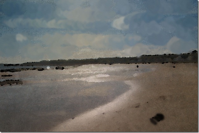
For Friday PhotoArt this week Bonnie suggested that we make a photo look like a painting – a nice contrast to the years when painters tried for ‘photographic capture’ in their art.

Earlier this year I enjoyed an exhibition of painters from Impressionism and beyond with a focus on their obsession with capturing light.  So I chose some photos where light is a strong feature to use for this creative play.

photoart-june-3

First I lightened the photo; then added Pixel Dust PhotoArt texture painterly on multiply blending mode at 62%; then I duplicated the original in softlight blending mode at 60%; flattened and duplicated; added pencil stroke filter and blended in hardlight.

photo-art-june-2

I chose this photo because for many years we had an oil painting by my Grampy on our wall of willow trees.

I duplicated the image and used multiply blending mode at 62% on the top layer; then I added Pixel Dust PhotoArt texture old master twice – the first I used softlight blending mode and the top layer i used multiply blending mode both on 60%.  I flattened and then applied the paint daubs filter then I added the original using the hardlight blending mode at 62%

photo-art-june-22-1

First I applied several artistic filters (sorry didn’t note which ones); added Pixel Dust PhotoArt texture Impressionist in softlight blending mode at 60% and then the painterly texture in multiply blending mode at 66%.

I had a lot of fun playing with painting effects and look forward to see what others have done.

Wednesday, June 27, 2012

Summertime photo scavenger hunt –labyrinth

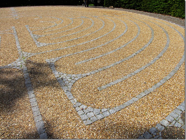
One of the items on Rinda’s 2012 Summertime Photo Scavenger Hunt is a maze or labyrinth.  I wasn’t aware of either in Edinburgh so I turned to Google and discovered that there is a labyrinth in the park on University campus.  It wasn’t there when I was a student but that was 30 years ago and a lot has changed since then.  The labyrinth uses the design from one in Chartres Cathedral in France.

So given that it was sunny on Tuesday and with so much rain each sunny day must be spent outside – I set off to find the labyrinth.

labyrinth-1

and walked along the twisting path

labyrinth-2

until I reached the middle

labyrinth-3

I like labyrinths and the idea of taking a long walk by twisting the path to cover every part of a small space. 

An unexpected and good start to this summer’s photo scavenger hunt.

Monday, June 25, 2012

SUMMER OF COLOUR 2–rose tinted

Kristin provided another scrumptious colour palette for us to play with

summer-of-colour-3

The pinks reminded me of the roses that are blooming in all the gardens I walk past (in the occasional gaps between rain) and so I used the painting tools in PhotoShop Elements then added a stined glass window effect at the end. I decided to use a technique that is popping up in digi scrapbooking a lot at the moment for the letter - shadowed cut-out speech bubble.

SC-3 

half way through and I’m pleased with how my final word is shaping up with a good range of digital technique

CREATE-PROGRESS-3

As well as enjoying the creative process each week I’m also relishing looking at all of the wonderful pieces that others are creating and the wonderful range of techniques people are using – check them out here.

Friday, June 22, 2012

Back when the world was black and white

vintage-3

At first glance would you believe these photos were from my grandfather’s photo album?

vintage-2

They aren’t – I processed them to look vintage but my guiding inspiration was a photo album from the 1930s or 40s

vintage-1

Process to a vintage look is the suggested theme from Bonnie for Photo Art Friday this week and I’m keen to see how others approach the vintage look.

This is the method I used

1. Use gradient map to turn the photo black and white

2. Duplicate the photo and use blending mode overlay or hardlight to sharpen the lines and add more contrast

3. Add some warmth and texture – On the lobster pots I added the bronze gradient map on vivid light at 16% opacity;  On the portrait orientation boats I added Bonnie’s Age It texture using vivid light blending mode at 54%; on the landscape oriented boats I used Bonnie’s Vintage Craqueline texture on hard light blending mode at 85%

4. I then added them to 3 of the aged frames from The CoffeeShop blog

Now off to work on the theme for next week – process to look like a painting – I feel some Impressionist beach scenes coming up

Wednesday, June 20, 2012

well i saw it

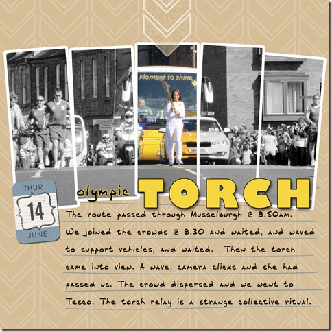
torch-lo

I saw this photo idea somewhere on blogland (sorry didn’t save link) and thought that the Olympic torch relay was a good subject where I wanted to highlight a section of the photo.  Felt good to be making a layout for a change.  I’ll be printing this 6 x 6 which is why the font looks big for a 12 x 12

Credits – I made the template.  Paper is Audrey Neal’s Whiteout paper set from Design House digital; date is from Biograffitti (now retired)

Monday, June 18, 2012

Summer of colour–minty rockpools

for our second week of colour inspiration Kristin gave us a cool mix of blue-greens and dark brown from mint chocolate chip.

summer-of-colour-2

Interesting how much blue there is in the mint ice-cream colour.

I used rockpools as my summer inspiration to create my piece this week, which features the 2nd letter of ‘create’. [I described my overall project goals  here]

I’m enjoying having two pieces to work on, using different techniques, the background and the letter.  Also enjoying pure digi creation with no photo as a starting point.

summer-of-colour-2-final

Check out all the wonderful creations on Twinkle, Twinkle – last week there were over 100 pieces linked in a wide range of media.

Wednesday, June 13, 2012

its all about the colour

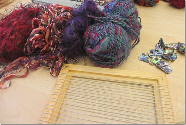
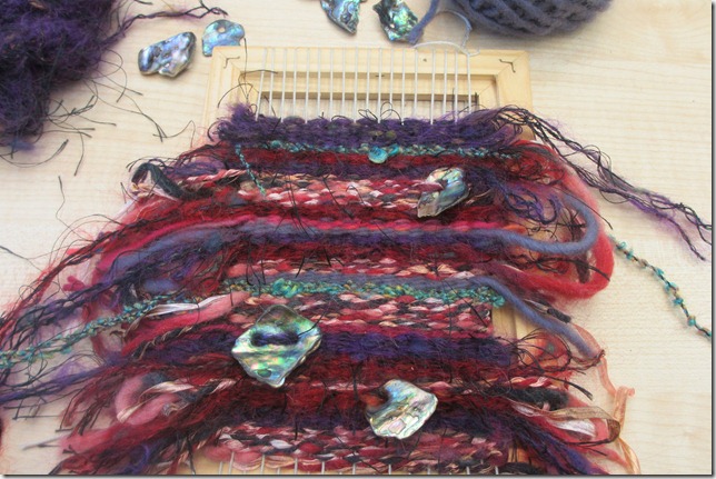
I went to a weaving workshop last week for some creative play.  The workshop was set up as ‘here are the materials – go have some fun’.  The host said that the process of weaving was easy and that the creativity was in the choice of colour and texture and that she always enjoyed seeing how different the pieces were at the end of a workshop based just of different colour choices. 

There were lots of bags of wool of varying textures and colours and we all had fun rummaging to find several to start off with.  I'd brought some pieces of paua to incorporate and chose purples and reds for my piece.

The looms we were using were strung over a wooden picture frame with clits cut top and bottom to hold the thread – very simple and effective

weaving-1

The weaving process is easy which meant we all had time to chat and give advice to each other on which yarn to choose next.  None of us at the workshop were normally yarn crafters but all had fancied a dabble in a different medium for a few hours.  The piece soon built up

weaving-2

I left all the ends hanging and dealt with them at the end but next time I’d either weave them in or leave a tail on each piece to create a fringed edge.  We all managed to fill our frame in a little over the 2 hours allotted.  We cut the strings at the back and tied them tight to keep the weave tight.

I decided to put mine into a frame, with the glass removed, which meant that all the ends are hidden behind the back piece and I didn’t have to fiddle with finishing them off – a stage that I’ve often stalled at.

weaving-3

The previous photo is  a better reproduction of the richness of the colours. 

I’m very pleased with my piece and had a fun afternoon playing with a different material.  Now I’m thinking of using up some of my embroidery floss stash on some small woven pieces.

has anyone else dabbled in weaving ?

Monday, June 11, 2012

ice-cream colours–rainbow sherbert

For Summer of Colour this year, Kristin is using ice-cream for the colour palette inspiration.  Our first was a lovely vibrant rainbow sherbert.  As my first step to digital creation I made a colour palette from the image

sumemr-of-colour-1

Over the six prompts I’m going to create pieces to spell create – I started with C.  The idea that I had in mind for inspiration on this one was a picnic in the sun.

summer-of-colour-1-creased s

I made this during the week but kept thinking something was not quite right and yesterday I realised that the background was too flat so I added the ‘creases’ that you see here and then it felt like mine !!

Looking forward to seeing what others have created in a wide range of media – people can post a link all week.

Friday, June 8, 2012

black and white photoart

Friday again which means linking up with PhotoArt Friday at Pixel Dust Photo Art.

I like the weekly prompt because it gives me a starting place alongside the blank canvas.  This week the suggested theme is black and white.  I created 2 pieces using different approaches.

First I looked for a photo with strong structure which did not need colour because I thought that would translate well.  I used a photo of a boat that I took on the photo walk at the weekend.

b-w-handmade

First I used the cutout artistic filter and then I turned it black and white using gradient map filter.

heartland-textured

On this one I used the Heartland effect from Pioneer Woman and then removed colour.

I tried some other methods of creating black and white and was interesting in the range of results – some very grey, some with more contrast.  I will definitely be playing with black and white again.

My second approach was to choose a brightly coloured image with good texture – I used a close up of a poppy.

poppy

I used gradient map to turn it black and white and added poster edge filter.   I love how the texture stands out. I added a frame of the poppy colour for fun and because it felt right.

Wednesday, June 6, 2012

Summer inspiration

Last year my favourite creative challenge was Colours of Summer where we had a single colour prompt each week and participants were invited to create a piece in the medium of their choice.  I created digi art (not photo based) and added a Dr Seuss quote to each.  I like my pieces so much that I had 5 of them printed onto coffee mugs that I use everyday.

aug-12-(1)

This week Kirstin launched the new Summer of Colour with ice-cream flavour colour inspiration giving a colour palette each week – the first is vibrant orange and pink.

I’ll be creating digitally again but I wanted a theme to tie them all together and give me a starting point for each week – having the quotes last year really worked for me. 

I saw the fabulous, vibrant colours on Monday but still had not come up with a uniting theme.  So I went for a walk because I’ve found that I often have good creative ideas when I let my mind wander on a walk.  The recent rain and sun means everything is looking lush beside the river

And the idea emerged – there are 6 colours across the summer so I’ll feature one letter from the word ‘create’ on each of the pieces and end up with a word art creation to add to the wall in my craftroom alongside the one I created using different crafts.

create-on-wall

Invigorated by this new plan I set to work on Photoshop Elements as soon as I got back – ready for the reveal on Kirstin’s blog next Monday (see button on left panel).

Anyone else playing along with the ice-cream colours?  And what do you do to prompt creative ideas?

Monday, June 4, 2012

photo walk around the harbour

the 3 villages to the east, along the coast, are holding their annual art festival which includes a photo walk.  My Dad and I went along on a rather blustery Sunday and snapped away at

photowalk-3

seagulls and

photowalk-4

bunting on boats, on houses and in gardens

photowalk-5

sculpture

photowalk-6

a lively sea

photowalk-2

the twin chimneys of the power station (and related tower like shapes)

photowalk-1

various colourful and picturesque components of a harbour.

My third photowalk, all in different places and organised differently.  Each one a lot of fun.  Now looking forward to my other favourite photography task – the scavenger hunt – Rinda has promised to unleash hers soon.

Friday, June 1, 2012

counting May

The end of another month and time to join Julie Kirk in her month in numbers.  As with the previous 4 summaries, this will go into my Project Life album.

may-in-numbers 

I went back over previous summaries and made a point of using some of the same categories to provide some comparison over the year.