I’ve kept a diary for over 15 years. They used to be black pen in shop bought desk diaries. Then I was inspired by Simple Abundance to embrace coloured pens and paper. Then scrapbooking added embellishments and differnt paper. And now I’m playing with digi and decided to make the cover for my 2011 journal using digi collage.
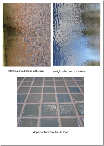
Parts of these three photos plus diesel text became this cover thanks of the magic of overlay style in Photoshop
The colour is mostly from the first river photo. The contrast in the 2nd river provided the contrast of the lighter lower right corner. The tile outline used at low transparency created the squares. I then used some grunge brushes around the edges. The diesel font has been bevelled to make it stand out more, as if I had stamped it in thick paint.
I have been taking as many texture or digicollage photos as memorykeeping ones recently – I find it provides a totally different perspective.
Do you keep a daily journal or diary and has it been influenced by your creative habits?


4 comments:
really interesting looking cover! I love the texture
Hooray for the chance to catch up on your blog at last! :-)
This is stunning, Helena - so much interest and texture! Love it :-) My journaling tends to be via my blog really, I don't do much 'in-depth' day to day, just a note (with my Project 365 pic) to remind me what we did. My diary has a notepage opposite each week though so I sometimes make more detailed notes on that.
It's been good to see your weeks 44, 45 and 46, too, and I love that 'lonely in a crowd' idea xx
I love these textures, Helena.
I think it's great that you keep a journal - that's something that I have done here and there but never stuck to it. I really like the idea of journaling with a picture in mind...thinking about making that a project for 2011. :o)
Oh my god! how did you do it because it is so artistic and very nice to look at, very good work...
Post a Comment