Front page is photo of me in black and white – I used a Photoshop Album from Pioneer Woman called black and white burn. Continued with the Ali Edwards handdrawn think borders to outline text.
Pleased with the layout that I’d planned for each day and that I turned the album to landscape, because that is how I take most of my photos.
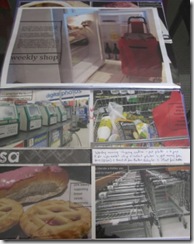
Here is an example of one day: one big photo, 4 normal size photos with journaling strips; another 4 normal size photos and a page of prints and bits and pieces.
Enjoyed writing on the photos and using the boxes to define the area for the text. Once I had put everything into the page protectors I added journaling strips and included some more details that were not written on the photos. I then went through and used stickers on the page protectors where I wanted to add more writing.
Pleased with how it all came together and plan to do the project again in future years. Putting the page protectors together beforehand and having the digi elements set up ready made it all work and made it easy to create the final album.


2 comments:
I really like how your album turned out. I knew I wouldn't have the time to do one so I sort of lived through yours. Nice work!
It looks fab, Helena :-) I shall definitely do this project at some point in the future - it's been lovely watching how other people have done it this time round! xx
Post a Comment