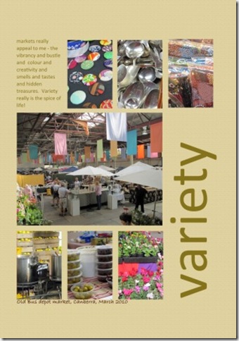
When I had finished the mosaic from the market on Monday I was inspired to turn it into a digi page. I had a faint memory of a Cathy Z layout which was very similar to the mosaic design that I used – and I found it. In the sketch the top line of photos are moved to the right to make way for a text block and the title fills the new vertical space. Based on the sketch and words I included in the blog I made this page.
The journaling reads – markets really appeal to me – the vibrancy and bustle and colour and creativity and smells and tastes and hidden treasures. Variety really is the spice of life.
I printed out the words and the photos on different sheets so that I could cut our the photos and stick onto the page – with digi pages I am still not used to how flat they are and so like to reattach the photos for a little contrast.


2 comments:
Looks great! I love CZ's clean, simple style.
Thanks so much for you comment on delaying posting, Helena! I never ever noticed that before (see I am pretty new at blogging!) there are posts that I don't want published until a certain date so I wait until then to type it. This will make my life a lot easier. You are a life saver.
Elizabeth
Post a Comment