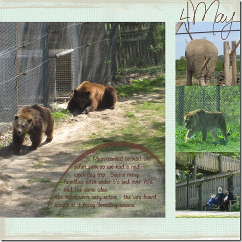
The date is a brush from mfen; background paper from the DHD scrapbooking day bloghop freebies; the grunge strips top and bottom are in a grunge brush set by ShadowHouse. And the safari park is Blairdrummond.
Journaling reads: Mum wanted to visit the safari park so we had a mid-week day trip. Seems many families with under 5’s and over 70’s had the same idea. The bears were very active – the info board hinted at it being ‘breeding season’.
I used Shimelle’s weekly sketch as the starting point for the design. Her sketch has more embellishment and I did try some things but nothing clicked for me. I was turned on to scrapping by Cathy Z’s simple graphic style and still tend towards that style. I love seeing layouts created by others with lots of embellies and clusters but never feel happy with it myself.
So I’m interested – if you were given this layout to ‘finish’ what embellishments would you add and where? Honestly I am interested – for me this is finished but I know for others it is only half done so please tell me what you would do and I promise I will not be offended.


4 comments:
Personally, I would leave it as is. However, if I had to add something, I might change the lower strip to look like grass and/or add something indicating how we got there (or something else memorable about the trip). The other thing I might do, add a bit more of a title.
I'm not a flowers and frill type of person so I might not be the best person to comment.
I think it's got everything it needs Helena - pictures, text and a date. Perfect.
Those bear photos ae great! The only extrathingI might add i a title an it would probably go along the bottom strip, but hey i am no expert at all!!
Yes the only thing I would add would be a title but I've only just learnt to put titles on my Lo's so who am I to talk? I love it as it is. I agree with you, I love to see embellished pages but just can't do it myself, Less is more for me x
Post a Comment