Pages

Tuesday, May 31, 2011

persue pleasures

As I said yesterday, pithy phrases were one of my main ‘take aways’ from browsing Sarah Ban Breathnach’s Romancing the Ordinary this month. I received the book as part of Sian’s Pass the Book project and will be passing it on next week. If you would like to be in the draw to receive this book next then please go to yesterday’s post and leave a comment. I will make the draw on the morning of Monday 6 June (UK time).

Here is another digiart piece that I made to display one of her quotes. This time I used a photo of fruit growing in the garden and Kim Klassen’s scratchy texture to create the piece. I used the exclusion blending mode which causes the change of colour from the greens of the photo to the soft purples in this piece. The font is one of my favourites – Papyrus and I added a stroke using layer style. I used the eyedropper tool to take the font and stroke colours from the image.

scratches-exclusion

I’ll be sharing some more creativity inspired by this book over the next few days.
If you want to be inspired by more texturized garden photos then check out Kim’s Tuesday Textures

Monday, May 30, 2011

inspired to play

Romancing the Ordinary by Sarah Ban Breathnach encourages women to notice and embrace our five traditional senses plus the sense of knowing (intuition) and wonder. I received the book as part of Sian’s Pass the Book project and will be passing it on next week.

Although the book is organised by months with suggestions relevant to the related Northern hemisphere seasons, I dipped into several months as the mood took me. I always find that with books like this which are filled with ideas that I latch onto one or two ideas and messages and let all the others flow past. If I were to read the book again next year I would probably latch onto other ideas.

As I read I found myself noting down several phrases that appealed and I decided to create some digiart pieces as a way to display these phrases around my house. Here is one of them:

play-is-a-mood

I created the digiart by using blending modes on three photos (the beach, rust and the sea). I used the exclusion blending mode to create the vibrant colours. The font is Edo SZ and I added a bevel layer style and a stroke (thin line around the edges). I used the eyedropper tool to take the colour for the text and the stroke from the digiart.

I’ll be sharing some more creativity inspired by this book over the next few days.

If you would like to be in the draw to receive this book next then please leave a comment below. I will make the draw on the morning of Monday 6 June (UK time).

Sunday, May 29, 2011

A glimpse with 5 photos

I’ve been enjoying the way Ashley’s Scavenger Hunt Sunday provides a glimpse into each person's life and personality and the variety of photo subjects for a given hunt topic.

ssh-28-stil-life

Classic still life – well this is what I think constitutes a still life, made up from things that I had to hand.  The round mat is made of bamboo and is from Bangladesh.  The basket is made from flax and came from New Zealand.  Strawberries and blueberries are the fruit that I had in the fridge. The table and wall are my dining room.

ssh-28-selfie

Self-portrait – I used the technique of holding my camera at arms length, with my arms down and looking down onto the camera – makign sure the sun was behind me and I had something interesting behind me – in this case the lovely new leaves on the tress by the river.

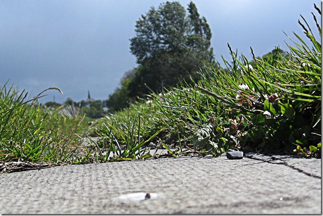
ssh-28-floor

On the floor – I had some fun taking photos with the camera on the floor, it really gives a different perspective.  This was also from my walk by the river – I like that you can just see the steeple on the skyline.

ssh-28-lines

Lines – another from my river walk.  This is a small weir to keep the tidal water (on teh left) from going further up the river.  I love this area for photos with the changing textures and colours.

ssh-28-fresh

Fresh – the strong winds on Monday brought down some big trees, the fresh wind continued all week with blustery weather.

Friday, May 27, 2011

so much rain recently, but …

its-only-wet-1

journaling reads

It starts to rain on my walk – do I run for cover?  NO, I take photos of raindrops on the river

On a tropical holiday it rains all day – do I complain?  NO, I see how many ways I can photograph the ran

On my way home from work the rain starts – do I put up my umbrella? – YES but then take photos of the rain on it

We arrive at a scenic lookout but it’s pouring with rain – do I stay in the car? – NO I go to take the photo.

Because – it’s ONLY WET

Layout prompted by the incident in the 1st line of journaling earlier this week, and one of my sister’s regular emphatic statements.  Found the other photos from my photos of the last three years.

Template from Scrapping with Liz – I love her templates because I can use them in a simple, graphic style

Background filled using the eyedropper tool in PSE.  I took the colour for the titles from the photos too with the eyedropper tool.  I use the eyedropper tool to choose a colour more often than I use a created paper or alpha because I like being able to create the repetition using colours from my photos.

Title Font – Edo SZ and I added bevel layer style on the  title – to me it looks like still wet paint

Effect in top left corner – Ray of lights brush by Skeletalmess

Thursday, May 26, 2011

blue means …

blue-3-d
Regular readers will know that I love to walk by the sea – strictly speaking this is a tidal river mouth (called a firth in Scotland).  I often use the wooden breakwaters in my photos and this day they were really showing the waves as they broke.  Loved the movement in the foreground.
When  Bella Skye announced her photo competition with the theme of blue I knew I would use one of my photos of the water and this one jumped out at me when I started browsing my recent photos.  Head over to her competition page to see how others have met the challenge.
What would be your first thought for the prompt of blue?

Tuesday, May 24, 2011

Exploring a texture’s effect

txture-test-1

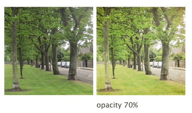
Since discovering the idea of adding textures using the blending modes in Photoshop, I have used this technique a lot to create interesting and lovely images. In each photo pair the one on the left is straight out of camera.

texture-test-2

My approach is to experiment and I admit that I do not have an idea of what the texture will do to an image before I apply it so generally I choose a texture and then open several photos and apply the texture to see what happens.  The texture in all of today’s images is by Kim Klassen called yesteryear and you can download it from her site.  Because the texture is square and has an edging on it I cropped all of my photos to square before applying the texture.

texture-test-3

Often I then go through all of the blending modes to see what they do.  For this set today I used ‘soft light’ blending mode for them all, so that I could compare what happens.

texture-test-4

I did vary the opacity so that in some the texture effect is decreased.  I noted the opacity in each case.  Again I experiment by sliding the opacity slider until I think it looks good.

texture-test-6

Often none of the textured images is wowing me so I concentrate on one and add some more textures, or sometimes another layer of the same texture with a different blending mode.

texture-test-5

Again I approach this process in a trial an error way rather than having a good idea of what any texture will do.  I have tried following a recipe from someone’s image that I like but have not found it satisfactory because my original photo is so different from theirs.

texture-test-7

Sometimes I like part of the effect, but part of the original photo has been lost – for instance the bluebells above.  In this case I used the eraser tool to remove the texture on the bluest parts of the flowers.  This can be a fiddle but often adds the necessary pop to the image.

texture-test-8

And sometimes I love the effect but decide that the image needs something else so I add some words

texture-test-last

Having thought about my approach, I am content to continue in my exploration approach.  I don’t feel a need or desire to study the impact so that I can predict the effect of a texture on a photo.  I am happy in using my creativity in knowing when to stop, save and print or post.

As the quote suggests, we all have different perspectives and goals.  This was my favourite of the images I played with in this session – which was your favourite? 

Kim Klassen sets a texture challenge each Tuesday – this week it was to use the yesteryear texture.  To see the wonderful images created by others using this texture check out all the linked up posts here.

[oh and the quote is by Adenaur – first Chancellor of Federal Republic of Germany]

Sunday, May 22, 2011

Tropical dreaming

tropical-dreaming

check out Inspiration Avenue on Monday for others’ tropical creations.

I took all of the photos here.  In 2009 I spent several months travelling around the island nations in the Pacific.  The chair was on a small island in Vanuatu; the island / atoll is In New Caledonia; the one above is Tana which is part of Vanuatu, the one above in Isle de Pines in New Caledonia, the top right corner is Tonga and the one below is also Tana.

Interesting that I think of the beach photos when I think tropical.  But then regular readers will have notice that I take lots of beach photos in Scotland too.

The digi process

For those who are interested in the Photoshop Elements creative process here is what I did (everyone else is excused).

The background is made up of two photos.  I used the eraser with a soft brush on 15% opacity to erase the top of the chair photo above the curve of the palm, until there was no line.

To help the words stand out I added a 3px stroke in green and a default drop shadow.  I often add a stroke layer style to help text stand out.

The five ‘dreaming’ photos are clipped onto a shape.  I used one of the talk bubble shapes that comes with PSE but cropped it to just the top bubble.  I added layer styles to all of the shapes too – default drop shadow and a 3px stroke in white.  I played with lots of different layer styles, including bevel, before settling on this.  I created the style I liked on one shape and then copied the layer style, selected all of the other shapes, and pasted the layer style (copy and past layer style is on the menu when you right click on a layer in the layer panel).

If you have any questions about what I did, ask them in the comments

Friday, May 20, 2011

Amy made me do it


A simple proposition from Amy of Over at Our Place – create a simple, no fuss layout about something from this week – keep it simple and just do it.  What a good idea I thought but did not create the layout.  Then Amy blogged about it again and even admitted to nagging us.  So I opened Photoshop Elements, looked through photos from the week and a collaborative kit that I collected on Scrapbooking day and made a simple page, based on Amy’s template.

may-20-log-2

[paper and word art from the Design House Digital, Scrapbook Day collaborative kit – these by Gennifer Bursett]

Then I thought, that was easy and fun so I grabbed my camera and the books I am reading and took a photo to create a second page using the same layout.

may-20-log

[papers from the same collab kit – these by Sara Schmutz]

Both of these pages are normal photo size.  I’ve been doing this a lot recently and storing the results in a traditional flip photo album – digi pages simple and cheap.

As well as prompting and nagging, Amy will be sharing all the resulting pages.  You still have time to join in – check out her original post, and be sure to check out the rest of her fabulous, powerful, simple digipages.

Thursday, May 19, 2011

Memory Keeping on the move–3 taster tags

These taster tags are what I’m going to use again next time I travel. I like them because they are easy to use and they are a fun way to record the little details of holidays. And I love anything that involves a jump ring!

tags-1
Each tag has a title on it. When I come across something I want to record I select the appropriate tag, hand write the story and stick on a number for the date. I like to have things dated – I just do. If you don’t feel the need for having the date then no problem, leave it plain or take some pretties to add. Then I put the completed tag on the jump ring to keep them in order.

tag-5
When I get home I prepare the photos to stick on the back. The tag is half of a normal photo (4x6 inch, 10x15 cm). At different times I’ve prepared these in Picasa and at the photo machine in the supermarket and using Photoshop Elements.

tags-6
In anticipation of my next trip I’ve been thinking about the titles I want to use and came up with 8:
  • · Yum, yum – because when I travel I always like to try new foods
  • · Done that – to cover the ‘must do’ things or a particular goal or test involved in the trip
  • · Did you see? – for all those times you say that – for big things like the sunset or view and for small things like a cute grubby face or newly confident swimmer
  • · And then … - for those little stories it’s good to remember
  • · We laughed – for things we saw or were said or did that created laughter
  • · £££ (or $$$) – because I like to note down the costs of basics and sometimes of something special I bought
  • · The winner – to include the best …. View/seat/beach/snack/helpful person
  • · Listen – for memorable things people said – directly or overheard and also for things like the sound of birdsong or the surf or waterfall or volcano
Here is my taster tag box all ready to go. I like to pack it all in a little kit to keep everything safe inside my bag. I put some washi tape on the back of each in the space that will be above the photo – because my new washi tape jumps off the shelf at me if I haven’t used it for 36 hours. I’ll probably round corner the bottom – but after I have stuck on the photos so I only have to do it once (learnt that lesson the hard way).

tag-2

Free download
4 tags fit on a sheet of paper so these 8 take 2 pages and I printed each twice so I can use each heading twice on the trip (sometimes I take more copies).

I thought some of you lovely readers might like to use these tags so I’ve attached them here for you to download. I have included A4 and US paper sizes and I did $ as well as £ (if anyone want a euro sign let me know and I can send you it).  All the versions are in one zip file.

tag sheet words 1 A4tag sheet words 2 $ UStag sheet empty US

I also included a set of tags without the titles if you want to print blank ones and write or stamp on your own titles.

The files are png files so you can also open them in photoshop (elements) if you want to make changes. Use the Type tool to add your own title. The font I used is Rub This, if you want to match those tags. [I’ve got tips on using the Type tool and on fonts on DigiScrap Buddy]

If you use the tags, I’d love to see what you do – I’ve created a linky in the Memory Keeping on the Move page – see heading at the top of the page under the header.

What other titles can you imagine using? I’m always interested in new ways to record the tasters of a trip. Remember the title has to fit in that space – 12 characters, including spaces. You never know, I might make up another sheet of tags for download next week.

If you missed parts one and two of this series – see the tab at the top, Memory Keeping on the Move - under the header

Tuesday, May 17, 2011

Vintage image from the docks

vintage-textured-ship

I love this image – I want a large print of it.

I made it during the week and when I came to write the post today and inserted the image I was wowed again.  If I came across it somewhere else I would believe that it is an old postcard or illustration from a book. But it isn’t – I took the photo last week and applied textures for Kim Klassen’s Tuesday texture challenge – vintage is the challenge this week.  You can see how others met the challenge here.

Here is the straight out of camera shot – rather ho hum I think.  But I’m finding that the texture magic works best on my not so great shots.  How about you – do you tend towards your great or your ho hum photos for texturing and do you take photos with the intention of using them for texture?

may-7-(31)

For those who just like to enjoy the image you can stop reading now!  For those who like to know how it was done:

First I boosted the colours – seems a bit odd when I am then going on to remove colour but the boost increased the contrast in the image.  I used the Pioneer Woman boost action – three times.

Then I applied three textures from Kim Klassen.  Cinnamon on darken blending mode at 80% opacity then Magic 1 on screen mode at  100% opacity then Portrait on darken mode at 100% opacity.

Monday, May 16, 2011

A bear on a layout –but is the layout bare?

safari-park

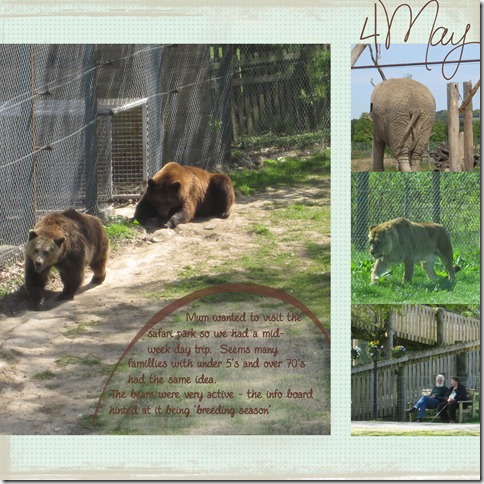
The date is a brush from mfen; background paper from the DHD scrapbooking day bloghop freebies; the grunge strips top and bottom are in a grunge brush set by ShadowHouse.  And the safari park is Blairdrummond.

Journaling reads: Mum wanted to visit the safari park so we had a mid-week day trip.  Seems many families with under 5’s and over 70’s had the same idea.  The bears were very active – the info board hinted at it being ‘breeding season’.

I used Shimelle’s weekly sketch as the starting point for the design.  Her sketch has more embellishment and I did try some things but nothing clicked for me.  I was turned on to scrapping by Cathy Z’s simple graphic style and still tend towards that style.  I love seeing layouts created by others with lots of embellies and clusters but never feel happy with it myself.

So I’m interested – if you were given this layout to ‘finish’ what embellishments would you add and where?  Honestly I am interested – for me this is finished but I know for others it is only half done so please tell me what you would do and I promise I will not be offended.


Saturday, May 14, 2011

Memory keeping on the move 2–daily journal

I enjoy travelling and exploring new places and I’ve had plenty of opportunities to visit some interesting places for work and on holiday. Since I started scrapbooking in 2006 I have used several different methods to create special holiday albums and to scrap while travelling. I thought others might be interested in what I have done and what worked for me. So each week I’m going to showcase one of the projects that I have used to record my travels.

Memory keeping on the move 2 - a daily journal on the move
tonga-album-3

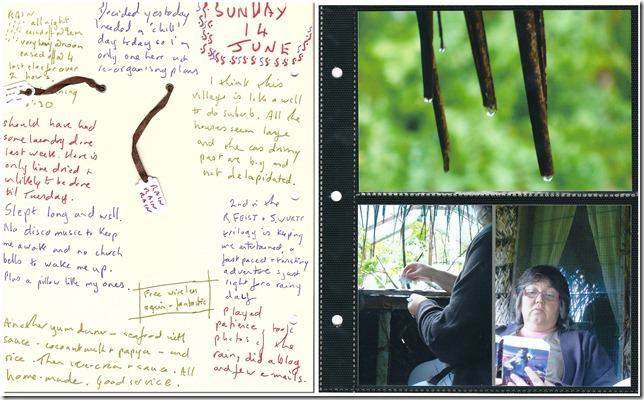
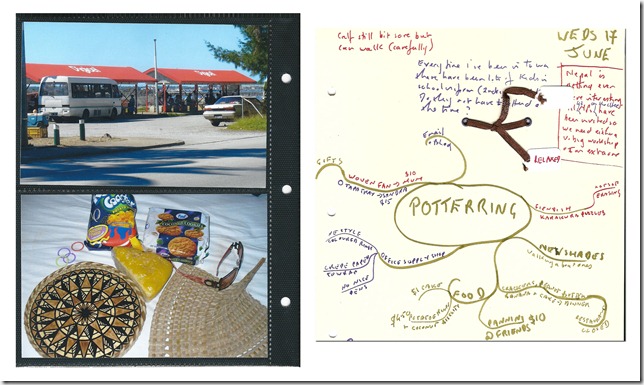
In 2009 I spent several months travelling, mostly to islands in the Pacific – the pages I’m sharing are from when I was in Tonga. I wanted to record what I was doing and my impressions as they occurred and I did not want to face the task of putting together a big album at the end of the travels.

I used a Stacy Julian mini-album as my inspiration to have a photo page protector and sheet of card for each day. Finding a source of page protectors with 2 photo slots took some searching – I found these in paperchase. I cut down A4 card for the pages and added some tags and ribbon to them one afternoon so they were all done before I went.

I took the card and the D ring album with me on my travels. I took the album as it was the easiest way to keep the card from getting bent and the completed pages in order. My only other kit was three coloured pens to write with.

I wrote bits on the card during the day – sometimes I recorded what I had eaten or listed what I had seen. Sometimes I described the scene or how I was feeling or noted a conversation.
tonga-album-2

Each evening I downloaded the photos from the day and decided what to put into the album. I had my laptop with me (it’s actually notebook size) so this was easy. I often created a collage – using Picasa. I saved them all with the date as the name to help me identify the right ones when I finally had them printed and was putting them in the album.
tonga-album-4

This process worked really well for me when travelling around for over a month. It combined a daily record and photos in a format that I had created. The casual, not rules approach that I took to what I wrote was great for jotting things down throughout the day. I will definitely use this set-up again. It would work well for a shorter trip too and I can imagine an album made up of several short city trips.

tonga-album-1

If you missed the 1st part of this series check back to the post about capturing everyone’s visual memory

Next week capturing moments and impressions with tags

Good mail

goodmail2

I’ve been receiving some lovely artwork through the mail recently and I didn’t even need to open the envelope to see it.  One of the things I love about this mail is that I have a good idea of who sent it just from looking at the artwork.

No surprise that the quirky lady above come from the quirky blogger who revealed she used bacon to decorate her son’s birthday cake.  If you are not familiar with Beverley check her out here.

And the vibrant paint effects immediately shouted Rinda at me, plus I recognise the handwriting because she uses it on her fabulous art journaling pages. Check out Rinda’s blog here.

goodmail1

and of course I’ve been sending out decorated envelopes too, and I think they reflect where my art is focussed at the moment – just a hint here.

goodmail-3

Thanks to Ginger for organising the exchange of decorated good mail and Sian who prompted it all by choosing the Good Mail Art book for her pass the book series. 

So the next time you send some mail to a friend, why not add some decoration to the envelope – its so much fun for the sender and the receiver.

Tuesday, May 10, 2011

DigiScrap Buddy

I’ve embarked upon a new adventure - I've created a website

logo-header
My hope is that DigiScrap Buddy will encourage people to explore digi creativity with PSE.  You can use explore in the way that suits you because I know that people differ in the way that they like to learn and  I have structured the site so that you can follow the pathway that you want to.

I’ve included digiscrapping and digiart and photo enhancing because I’ve noticed that all of these forms of creativity attract memory keepers and that often the boundaries between the forms are blurred.
Rather than chatter on more here and try to explain what DigiScrap Buddy is, I’ll let you go off and have a look.
If you have the time, I really want to hear what does and does not work for you so that I can make it better.  Please share your confusions – when things are not where you expected them or you don’t understand what I am saying - either in the comments here or using the DigiScrap Buddy email.

Sunday, May 8, 2011

Photo walk–Leith

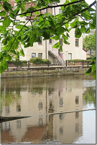
leith-walk-reflection#

The dockland area of Edinburgh has changed a lot since I lived here in the 1980s – it has been cafe-ised and there are lots of new housing and office areas but the docks still function too.  So there was some good variety for our photowalk on Saturday. The rain of last week had cleared so comfortable to walk around and no glaring sun to complicate photos.

The loose theme of the walk was ‘something old, something new’ which I captured in the contrasting buildings.

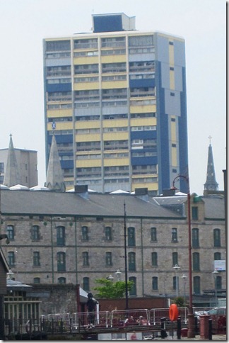
leith-walk-old-and-new

Here a block from 1970-80s behind the traditional buildings from the 1860-80s.

leith-walk-carlton

This time the 19th century buildings in the front are the ‘new’ when compared to the monument on the hill built in 1810.

I took some nice detail shots too of bronze statues around a merchant navy monument

leith-walk-bronzes-1leith-walk-bronzes-2

and this one I will caption ‘urban jungle’

leith-walk-flowers

It was fun wandering around as a group to take photos of our urban landscape.  Have you been on a group photowalk?

Thursday, May 5, 2011

Memory keeping on the move 1 – capturing everyone’s visual memory


I enjoy travelling and exploring new places and I’ve had plenty of opportunities to visit some interesting places for work and on holiday. Since I started scrapbooking in 2006 I have used several different methods to create special holiday albums and to scrap while travelling. I thought others might be interested in what I have done and what worked for me. So each week I’m going to showcase one of the projects that I have used to record my travels.

Memory keeping on the move 1 – capturing everyone’s visual memory

In 2007 I went on a safari holiday in Malawi, Africa with my parents, sister and nephews. We took over 3,000 photos over two weeks, on 4 cameras. I have made a big album with double pages for elephants, where we stayed etc and my Dad created a photobook.

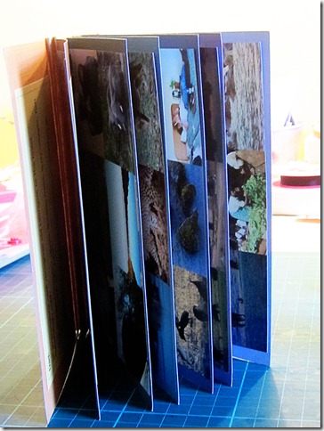
But I also made a small accordion album the week that I got back with is more of a snapshot of each of our visuals memories of the trip

malawi-book

Here’s how I did it -

On the second last night of our trip I asked each person to make a list of the 5 images that for them were strongest or summed up the trip. We shared the lists at dinner and I wrote them all down. When I got home I created a collage for each person with their 5 images and a picture of that person.  I made a copy of the collage for each person and also a set for me which I put together in a simple accordion album. On the page facing the collage for each person I listed the images. On the second night at dinner I had asked everyone for their first impressions and recorded them too on this page. 

Here is my collage

mk-on-move-malawi-collage

[birds flying overhead; mud hut villages, multiple animals grazing together; markets; hippo]

In our vast collection of photos I was able to find an image for everything on the list. I think it helped that there were 4 of us taking photos as we each had a different approach to what to snap. We all took the wildlife but after that - if it was a detail of birds or plants it was Dad, if it was lovely light or a landscape view it was my sister and if it was narrative or something quirky then it was me. And I knew what my teenage nephews were like so I had taken a picture of elephant poo – and yes one of them included that on his list of images and it is in his collage.

One item was in 5 of the 6 lists – hippos

mk-on-move-hippo-2

mk-on-teh-move-hippo

I think this set of collages adds another dimension to our albums of the trip because it is so immediate. The images we remember several years later are not all the same as the ones we listed at the end of the trip.

I would definitely do this again for a group trip where there were several people taking photos and there was a big visual focus of the trip.

Next week – a daily journal on the move.

Tuesday, May 3, 2011

Coffee with a little nutmeg

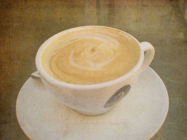
texture-may-coffee

I’ll freely admit that I care about my coffee but I have been surprised how often I have used this photo that I took in Sydney (Australia) in 2009 – OK I accept it says something that I took the photo in the first place.

Kim Klassen’s Texture Tuesday challenge this week is to apply texture to a coffee or tea cup so I went to this photo again.  I added the nutmeg texture twice – first softlight at 100% and then screen at 36% and then I painted back a few highlights.  To see more textured coffee cups check out Kim’s cafe.

Don’t worry, my next post in not about coffee – but it does relate to this post because its about memory keeping while travelling – hope to see you then.