Pages

Showing posts with label digital template. Show all posts

Thursday, March 31, 2011

sign of the time

  sunset-layout

Inspired to create a layout when I saw the simple yet fabulous  free digi template on Cathy Zielske’s blog

The embellishments are from the Designer Digitals Collaborative For Humanity Kit : Japan where ‘100% of proceeds will be donated to the American Red Cross to aid in the help of Japan’.

The journaling reads

Love it when the clocks spring forward. The lighter evenings mean that I have my daily walk by the river and firth after dinner rather than earlier in the day.

I prefer a walk then because it serves as a good way to relax into the evening. Also there seem to be more birds on the water - mostly swans and ducks. And I love the light in the evening for photographs - so gentle and soft with interesting shadows.

Twice this week there have been spectacular sunsets behind the city which adds to the pleasure. The sky was an amazing colour and the skyline really stands out in silhouette.

I am half way to the firth by the time I see the western sky so the colour is always a surprise. As summer progresses I’ll be interested to see how the light changes on my after dinner stroll.

Has changing the clocks made any difference to your daily routine?

Friday, September 24, 2010

wonderful old photo

A photo of me, aged one, with my new puppy appeared in the local newspaper at the time (not sure why).  I now have a digital scan of the photo which I used in a simple ‘for the record’ format. I haven’t included the names in this version because these details are often part of the security questions asked for online secure logins. 

I like the basic format for some of the key older photos – easy to change the colours and the element in top left, and then just add the basic facts.  I adapted the ‘awesome’ template from Cathy Z.

for-the-record-pet-web

[Hibiscus created using the hibiscus font;  record is in rub this font, other writing is in fineliner script font.  Background is a texture from ShadowHouse Creations.  Design started with Cathy Z layered template.]

The colours and element were inspired by the ARTastic monthly challenge which uses a famous artwork as the starting point – this month it is Frida Kahlo’s Self Portrait with Monkey.

Tuesday, August 17, 2010

inspiring sunset

felt the urge to scrap today (on the computer) and pulled out some photos I took in May when I had a week on the beach after working in Canberra (Australia) before returning to Scotland – just to explain why there are pelicans in the photos. 

I used one of the fabulous free templates from Katie Pertiet – she creates one most weeks for the Sunday Challenges on Designer Digitals.

I also used this layout for the challenge at ARTastic which uses a famous painting each month as its inspiration point – this month it is a sunset by Monet.  I just discovered this challenge site this month – I like the idea and that there is a month to respond.

pelicans in the sun

Journaling reads

Pelicans were the stand out stars of my week on the coast east of Canberra.

I love their silhouette, - it is so distinctive flying and standing on posts, as they do a lot even though they are big.

They look graceful gliding over the water but on land they are awkward and they make a big splash when coming into land on the water

I had stunning sunny weather and lots of light sparkling on the sea which seemed to stretch out for ever.

A relaxing and refreshing week.

Tuesday, August 10, 2010

bunting

bunting layout  compressed

template by K Pertiet at Designer Digitals

Getting back into some digi scrapping in amongst the house decorating (or stripping what was there before) .  Jumped started by two challenges – scrap weekly in 2010 challenge to use bunting on the page and the template is this weeks template challenge on Designer Digitals.

Bunting is a fixture of all the local festivals around here – does it feature in your local festivals?

Thursday, July 1, 2010

2011 album

yes even though there is more than six months of this year left, I know what my main memorykeeping project will be next year.  As soon as I saw the new ‘the monthly’ layered templates from Cathy Zielske (sold at Designer Digitals) I knew this was what I would use next year, and probably several years after – it answered questions I didn’t know I’d been asking.

Her concept is a set of page photo mosaic templates and one page for lots of journaling.  I will create one each month and print the whole year as a photobook I tried it out for May to see how I felt using it – I felt good. (the pattern papers are by Cuddlebeez). 

may monthly 4

may monthly 1

may monthly 2 may monthly 3

may monthly 5 may monthly 6

I love the design – I love everything Cathy Z – she is why I got into scrapbooking in 2006. 

I like that each month I can choose how many pages I need for that month and that I can have one page covering two days and other pages cover several weeks. 

I like that the scheme can incorporate 12 on the 12th or week in the life etc.

I like that I have a basic plan for recording the memories of the year that allows for some creative choice.

I will probably write on some of the photos, because I life the look.

I will use scrapbooking pages and minibooks too to record specific things and to allow for creative play.

Tuesday, May 25, 2010

is this addiction?

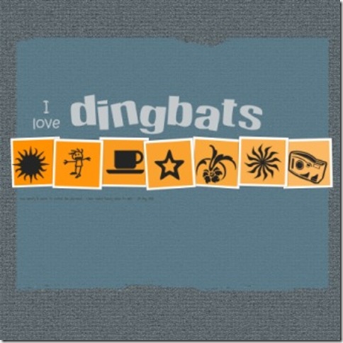
I’ve been using dingbats a lot recently and have been thinking I should do a post about that and list some of my favourites.  I will do that post later in the week. 

When I sat down today to decide how I would display the dingbats I kept being drawn to using a photoshop elements layered template – in other words to create a digi scrapbook page.  This has happened several times recently.  I start to think through the layered templates that I have as soon as I think about a story or idea that I want to tell.

I think I’m getting addicted to digi pages and layered templates.  But I haven’t made a page about that (yet!).  Anyway here is the dingbat page and I promise I will post telling you about these  7 and maybe some others later in the week.

i love dingbats web

Template by Kate Pertiet.  Title fonts – Happy for ‘dingbats’ and Just me down here for ‘i love’. 

Do you have phases of feeling addicted to a particular technique or crafting style?

Wednesday, May 19, 2010

spring is bursting out

Amazing lush growth everywhere – flowers and leaves and fruit – in my Dad’s garden.  This weeks challenge on scrap weekly was to make a layout featuring the seasonal plants. 

I’ve decided to experiment with some digi layouts that are not my normal simple and graphic style, because it is so easy to do different things when it is all using free digital elements. 

spring web

[template was part of the ScrapArtist birthday fun.  Pattern papers and stitching from Stuff to Scrap May blogtrain minikit by ScrapSis)

It is very different from my normal approach – things on an angle; photos overlapping; using pattern stitching. I have found that having a digi layered template makes it easier to experiment with a different style.  I  like how it looks.

For my next experiment with a different style I want to push myself to use a pile of different elements.

Have you experimented with different styles recently?

Friday, April 2, 2010

I can

i ca blogn

This layout is the result of several ideas that I’ve come across in my blogging over the last week.

Subject prompted by the Designer digitals challenge in ‘all about me’ called ‘I’m so good’.  One of the layouts from the design team listed things I can do.

Template was free as part of the Designer digital template challenge – created by Katie Pertiet


Scrap weekly challenge was to use a grid and I’ve been playing with 12 x 6 pages too.

So it all came together in this layout.  Background is colour and texture from within PSE.  Fonts are Bradley Hand and Rub this.

Words on photos are: memorize things; match colours; speak in public; touch type, heal fast, linedance. 

No particular reason for this list of 6, I jotted down things that came to mind and then cut down that list to this 6 because I then had the idea of using photos of part of me related to the task.

I did try pattern paper – big dots, small dots, flowers, stripes.  But I again found the patterns distracting as the background and so went back to my normal textured solid colour.  This is the first time I’ve used digital stitching and sorry I can’t remember where I picked up this free stitching file.  I am not much more careful at recording sources of digi materials.

What things would you have on your list that you can do?

comment tile

Tuesday, March 30, 2010

from mosaic to digi page

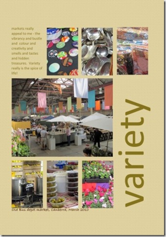
When I had finished the mosaic from the market on Monday I was inspired to turn it into a digi page.  I had a faint memory of a Cathy Z layout which was very similar to the mosaic design that I used – and I found it. In the sketch the top line of photos are moved to the right to make way for a text block and the title fills the new vertical space.  Based on the sketch and words I included in the blog I made this page.

variety web

The journaling reads – markets really appeal to me – the vibrancy and bustle and colour and creativity and smells and tastes and hidden treasures. Variety really is the spice of life. 

I printed out the words and the photos on different sheets so that I could cut our the photos and stick onto the page – with digi pages I am still not used to how flat they are and so like to reattach the photos for a little contrast.

comment tile

Friday, March 26, 2010

small things

I’ve been intrigued by and attracted to the various gratitude and photo a day digi formats which include words and photos within a normal 4x6 photo print.  I like the simplicity of printing, that they are contained and how well they work as a format for a series.

I’ve also been thinking it would be nice to record some of the small things that I have enjoyed about living in Australia for a few months.  So I decided to create a digi template to print off 4x6.  Not sure how I will collect them together yet but I am enjoying the format. Here are two that I have done.

small things1 small things2

comment tile

Thursday, March 4, 2010

Tongan tales

Last June I was fortunate to be asked to help facilitate a workshop is the Pacific Island Kingdom of Tonga.  This weekend I pulled out two sets of photos from that trip for a layout.  Each story had a lot of photos so I was looking at appropriate designs.  The Rinda set the weekly challenge as ‘use lots of photos’ and use them on a double spread.  So I went ahead and did both.  You can see how other people approached this challenge by clicking the logo in the left column.

Block of Squares  tonga

Layered template was from Laura, and I made some alternations to it.  The chipboard letters were free from Holliewood Studios called chipper alphas – again I modified them.

Journalling reads - We asked the minibus driver to take us out and about to  get a feel for life in  Tonga.  I snapped out the window in the belief that some of the photos would be in focus.  I was please d to find that I had a good range of the typical sights.

One thing  that we really noticed was the highly decorated graves with flags and lights and flowers and they are big and prominent. In some of the villages there were flags and bunting.  The driver told us this was because they were in the ‘tidiest village’ contest and judging had been the previous day. The vegetation was lush with lots of coconut,  taro and banana.  The pigs all looked healthy too. When we got a glimpse of the sea it was a beautiful colour and looked so enticing with the amazing soft sand. What I didn’t get in the photos was all the churches and the smiling, waving people.

I always like to take photos out of the window when driving around a new place.  I set the camera on sport mode and just take lots and lots of photos in the hope that some will come out OK.  I have got some great photos this way on a number of trips.

The second layout is a double spread

tonga rugby

the design was one I saw and liked in a magazine.  All elements come from within the software.

Journaling reads - As soon as we heard that Fiji was playing Tonga on the weekend at the end of our workshops we organised to go along.   Rugby is a much a  passion in the Pacific nations as it is in Australia and New Zealand so we knew it would be a likely game and an appreciative crowd.

It ended up that our party comprised three Australians, me from NZ, two Tongans, a Cook islander and a Fijian. Looking around the crowd was a good mix of visitors and locals too and the full age range from babes in arms to elders.

it was a lovely sunny afternoon and everyone was ina good mood, greeting friends, enjoying the snacks and having a look to see who was there.

Both teams performed a  traditional challenge at the start which really set the energy flowing.  Then the game got underway.  An interesting contrast of the solid, robust Tongans and the wiry, tall Fijians.  The game was open with lots of ball in hand and passing, as it tend s to be in this part of the world.  There was a long period of play before there were any throw ins or scrums.  The crowd showed appreciation for all good periods of play, regardless of who had the ball.  Admittedly cheering was louder and more prolonged  when Tonga scored.

Who won? Fiji scored the most points, but as they say
“rugby was the winner on the day”

I’m pleased that both, in different ways, tell a story with lots of pictures but do not feel too crowded.  Are you someone who avoids layouts with lots of photos or do you use this approach a lot?

comment tile

Monday, March 1, 2010

Fabulous layered templates

Earlier this year I won the Helium template in Liberty Cottage's elements series


Here is the first layout I made with the template

and here is another that I did at the weekend - the template is so versatile


The great news is that the templates in the elements series are now for sale at a very reasonable 75p (in UK speak), and all the money goes to charity.  Hop over to the Liberty Cottage website to see all the details, including how to be in to win the set of the first 10 layouts.

Thursday, February 18, 2010

stories from my travels

Last year I travelled a lot, mostly in the islands of the Pacific. I kept a photo journal at the time and have recorded the what I saw when stuff.  But I realised there were some other stories that I wanted to tell and decided to use these to practice digi layouts.  

I decided to do two layouts using the same template both to practice making them different and also because the second one is so much faster when I’m familiar with the template.  I am using templates by Cathy Z from here Design Your Life class as BPS.  Here are the first two.  

nepal peek

Took me ages to do the 3 lines on the photos and they are not evenly spaced – something I need to work on. Background created using colour and texture within PSE.  Palette comes from Stacy Julian’s weekly colour challenge (red and green with a twist).

pacific patisserie

Tried drop shadows here but clearly need to work on these.  The spotty paper is from DDD Mysteria Paper and I changed the colour.  The embellishment is cut from a patterned paper by funky R Dickinson.

Finding digi about equally frustrating and rewarding.  Having some stories I want to tell means I will get some practice and try out different components of the software.

comment tile

Friday, January 15, 2010

Hellium digi template

Last week I was lucky enough to win a didgi template in the Liberty elements series over at Liberty Cottage.  Kate’s designs have great simple lines and really focus on photos and writing.  Here is my first use of the template.

seahouses photoshoot web

The journaling says : a trip to the beach results in lots of photos of the sea and waves and rocks and birds.  Compulsory is the photo of the feet of everyone.  Fish and chips with mushy peas is another part of the Seahouses tradition.  The cafes give you a pot of tea and sliced white bread too and the fish is very fresh.  Sea air gives you an appetite.

It was a lot of fun using this design because it fits 4 photos.  This is the first time that I have done journaling ontop of a photo – I need to play with the font and colour some more to optimise readability.

Do you have any tips on putting journaling on the photo?

If you want to see more in the series – the first was won by Amy and the rest are still to come to keep an eye out on the Liberty Cottage website.

comment tile