

Showing posts with label decorating my home. Show all posts
Showing posts with label decorating my home. Show all posts
Friday, August 12, 2016

Thursday, June 2, 2011
Embracing the sense of taste
In romancing the Ordinary, Sarah Ban Breathnach encourages us to notice and embrace all of our senses.
Last week I was thinking about this as I was cooking dinner and about easy ways to incorporate the ideas into daily life. I got to thinking about the added pleasure from a meal when I add the right sauce or dressing. There are several that I know I like but often don’t go and find them in my recipe books once I have started cooking.
So I was thinking if I noted down a few and had them to hand in the kitchen then I would use them and thus have some plausible pleasures to hand.
So I turned to my scrapping supplies and decided that a business card page protector that I could attach to my fridge would work well – the plastic is practical and the 10 slots are the right size. I could have created a template in PSE or Word and typed up the cards. But I decided to handwrite on card as I thought of the recipes I wanted. When I left my last job I kept several boxes of business cards because I find the plain backs very useful for crafting projects. The cards were great for this project as they are already the right size for the pockets. I decorated each with finds from my small bits of card collection and a strip of washi tape on each for continuity.

Here is one of the recipes which originated from Nigella’s Express by Nigella Lawson. Caper sauce – she pours over green veg but I like it over root veg too – melt 75g butter then stir in 2 teaspoons of Dijon mustard and 1 tablespoon of lemon juice and 1 tablespoon of capers – then pour over the veg. (It is also yum without the capers)
Interesting where inspiration can lead. If you want the chance to be inspired by Sarah Ban Breathnach’s Romancing the Ordinary this month, as part of Sian’s Pass the Book project then please go to Monday’s post and leave a comment. I will make the draw on the morning of Monday 6 June (UK time).
Tuesday, January 25, 2011
hanging in the kitchen
I’ve been working on some of the storage/organisation in my kitchen. Both are things that I have had in mind since I started on the work in July last year. Two walls are dedicated to being able to hang things

Above the sink and worktop I have two copper pipes attached to the wall with brass plumbing fixtures. I wanted the copper and bronze because I love the colours and they fit with my orange walls. I have hanging from the pipes lots of S hooks as well as some shelves and pots (IKEA). Still working out which things I will keep where.
On the wall to the left of the door I have a whole row of cup hooks as my ‘command centre’ for calendar, pens, shopping lists, take-away menus etc. I also have a photo magnet rope and some decorative bits in the mix. Again I’m still working out what works where and which things to hand up. Lots of things are hung from bulldog clips and some from jumprings (seeing as I have lots in my stash).
I like to have things ‘stored’ visibly
I like that I am using copper and bronze fixtures
I like the abundance, the sheer number of hooks to be used. There are 51 cup hooks!
do you prefer storage to be hidden or visible?
Wednesday, September 22, 2010
saved for a rainy day
Sunday was rather grey and overcast so I made some digi layouts – just for me, just for fun, using some of the photos I’ve taken this month. Kept to my normal simple style. I did try some pattern paper on them but really I much prefer plain colour.

Layered template from Design House Digital TNT collection. Font in the title is orial, journaling is tahoma.
Just noticed the tt in the journaling – will have to live with it, I don’t keep the psd file of digi pages.

Layered template by Katie Pertiet at Designer Digitals. Fonts in title quadranta is the main one and fineliner the other.
Journaling reads
Each job needs different tools, multiple, not just one.
The big cupboard in the living room is full of tools, all 4 shelves and the floor. And the ones only used sometimes are in the shed.
When the renovation is over, these shelves will be transformed into the dresser. Can’t imagine it yet - it is still tool central.
[The paint colours in the bottom photo are my bedroom]
Thursday, August 5, 2010
‘blackboards’
while looking for large wall decal I came across a number that are ‘blackboards’. The inverted commas are because they now seem to be called ‘wet wipe’ boards and you can buy pens to use instead of chalk.
These two etsy shops caught my eye
Signs by SJ has perpetual calendars and also labels for boxes etc
Bradens Grace has notice boards in various shapes as well as labels

by Simple Shapes, and they do a perpetual calendar too
And my last word on decals {for now} I love these by Ellynelly


but they are not making any at the moment while they move to Australia.
I think I need more walls so that I can use all of these decals as well as having furniture and art against walls.
Monday, August 2, 2010
trees on the wall
Having shared the dandelion and urbanesque decals in my shortlist here are the trees that caught my eye to bring some oomph to my white bathroom. All of them allow choice of colour. [click image for link]
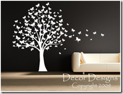
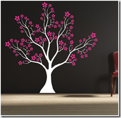


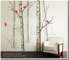

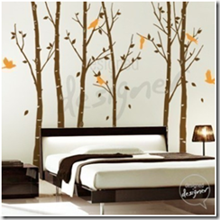

Way too many on this shortlist. Next I need to map out what else will be on that wall and how each shape will fit in the space. All of these have sizes in feet and inches which I can’t visualise so I also need to convert them to metric – all good brain gym.
Sunday, August 1, 2010
looking at large wall decals
I’m realising that decorating the house means a lot of time scouring through brochures and websites looking for the thing that I want or that grabs me.
I’ve also realised that some aspects of house decoration leave me cold. Really I cannot get excited about bathroom ‘furniture’ – as long as the basin, toilet and shower work then I’m happy. Perhaps part of the problem is that it is all white and I just do not get excited by white.
So I decided to liven up the bathroom by putting a large decal on one of the empty walls. Which meant several hours browsing various etsy shops and looking at an amazing range of ideas.
My favourites fall into three groups – trees; dandelion; urban [click image for link]
today I’m sharing the dandelions and the urban ones –


hard enough choosing between these – wait til you see the trees in the next post!
Saturday, July 3, 2010
living room colours
My thinking for the colour scheme in my new living room also uses a piece of fabric as the starting inspiration.

I like the warm and muted feel to these colours. They are basically versions of an analogous strong – green, yellow, orange, red – but all soft and muted or greyed versions. Not sure which colours I will put where.
I have some fabrics I bought in New Zealand before i left to use for napkins etc

I think they will fit in well, because my table will be in the living room.
Friday, June 25, 2010
colour in my new bedroom
I have to decorate in every room of my new flat so I’ve been thinking about colour schemes a lot. Purple is my favourite, probably signature, colour so that is what I’ve decided to use. I found a nice striped fabric in John Lewis which I will use to cover the bedhead and as the basis of the colour scheme.

The stripes are actually straight – the fabric is draped in the photo. The ceiling will be in the cream, the floor and furniture will be in the 2nd down (birch veneer). One wall will be in the deep purple and the other 3 walls in one of the other 2 purples.
I think the creams balance the purples well and I love the deep colour for the feature wall.
Using cream and fawn makes this a classic contrast colour scheme as yellow is opposite purple on the colour wheel – fun to be using all my colour knowledge on such a big scale.
Trying to photograph fabrics in the shop made me realise how much the camera can change the colours I see with me eyes.
Friday, June 11, 2010
my big new project
I just bought a flat. Just over a year ago I packed up my stuff and set of for some travelling before moving back to Scotland. I am staying with my sister and parents and have been house hunting near Edinburgh. On Tuesday I made an offer on a flat which was accepted – under Scottish law that agreement is binding so the flat is mine. Very excited.
The flat needs new kitchen and bathroom and every room needs decorating – yeah – a big project to keep me busy. I have piles of brochures that I am looking through and a book of graph paper for plotting room design.
I’m also thinking colour palettes for each room. I love colour so have been thinking about this a lot and gathering inspiration.

I used the fantastic colour site, kuler, to create some palettes. The site has lots of created colour schemes but it will also create them from a photo on your computer (or on flikr). You can choose bright, deep and so on and also customise your own.

Here are four that I made from this photo. I’ll be playing some more and using them while looking at some materials before deciding which version to use.
Love this aspect of kuler. I’ve been collecting other images as possible basics for colour range for other rooms. I’ll share them as I work on them.
And expect regular postings on aspects of home decoration over the coming months.
Subscribe to:
Posts (Atom)

