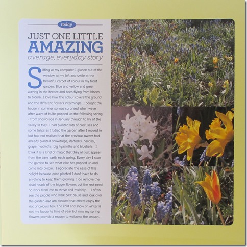
I’m taking a great 3 month class by Cathy Z on BPS called ‘clean and simple’ in reference to her hybrid scrapping style. I’ve always been a big fan of Cathy’s approach and design aesthetic and her teaching style. This is the third class I’ve taken with her.
We receive an assignment each week with tips on design and approach to memory keeping, a template and tutorials on using PSE for those who are new to it. Each LO follows Cathy’s process of designing on the computer and then printing the photos and title and journaling separately and then sticking them together on cardstock.
There is an interesting mix in class of those who are new to the digital aspect and those, like me, who are comfortable with the digital but have not recently cut and pasted for real (rather than using ctrl c and ctrl v !). When putting together a LO I remembered how frustrated I am at my inability to cut in a straight line even when using a trimmer and how hard I find it to line things up and how I get glue in places it wasn’t intended to go. And how hard it is to photograph a LO so it looks square and the colour looks good.
The LO above was easier to keep aligned because I taped the photo block and the journaling block together and then cut them both so the top and bottom lined up. And I doctored the photo in PSE to make it square ( I used the yellow of the background to fill in bits around the edge)
I’m really enjoying the class and weekly assignment. The class community is very active on the gallery and in comments and assistance and Cathy is present all the time, commenting on LOs and answering questions and joining in chat. It is these aspects of an online class that I most enjoy.
And it meant I recorded my enjoyment of all the flowers in my front garden.
Any tips for a returning paper scrapper?


4 comments:
It looks great Helena and you did a great job on the cap drop. Is that a different font you used for it?
This does indeed look great Helena. I used to love to scrap with real paper, glue & scissors but the LO's took so long for me to do!
Less is More is a good mantra for me when I do any sort of LO.
My tip would be to not let the perfect be the enemy of the good! Things in real life are bound to be wonkier than in digital. That's part of the charm, I think. Also, enjoy the tactile. Try to get some paper that you really love touching.
Rinda
It looks lovely - and I wouldn't have guessed you'd had all that difficulty 9though I have had the same myself!). Sometimes, I'll pop something onto a plain digital background for display on the blog, and then do a hybrid version afterwards which means I don;'t have to faff around :).
Post a Comment