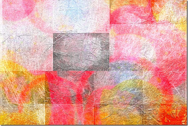
Abstract collage was Bonnie’s challenge to us for PhotoArt Friday this week. She provided one texture to use and invited us to add one or more image and another of her textures. I appreciated having these rules as it cut down on choice possibilities.
I’m really pleased with this piece and will have it printed large.
I know you can’t tell but the image is of black, red and white currants – one of my most used images in digital photoart pieces. I used 3 copies, each enlarged and rotated over each other in ‘darken’ layer mode, to provide the overlapping circles. Then I addedd the proscribed texture which gives the lines and then tried most of Bonnie’s textures over the whole image and didn’t like any. So I added a texture over just one of the rectangles – the darker grey one
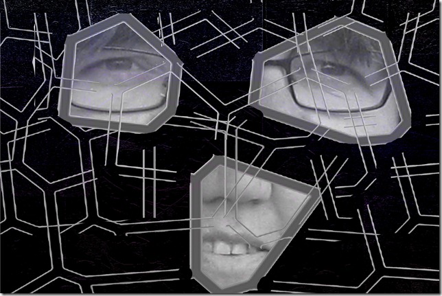
Then I decided to create another where it was easier to see the image from the photo. After playing with several ideas and perusing some abstract art on the internet I stumbled upon this image, using a self portrait and created 3 versions
Rather disturbing (as opposed to pretty) but that seems to be one theme within abstract art. Here is how I did these
Thank you to everyone for your comments on my minimalist pieces, I do appreciate all those who take time to say something. Now I’m off to see what other abstract art has been created to hang in Bonnie’s gallery.


14 comments:
Your first image is well done.
Abstract and light...can pick out the textures and still appreciate the whole pic.
Hugs
SueAnn
Gosh, this takes such a lot of both skill and imagination - what an intriguing result! I thought you had painted it - very skilful work!
This is the kind of piece that I think would look really cool on etched metal. Love the contrast between the lines and the curves. The color choice is really nice too…very eye catching.
I like the first picture, there are nice colours.
Brilliantly abstract! The berries abstraction is my favourite in its playful use of form and colour. Very cool, too, how you show your methods.
Wow! The portrait images are wonderful. The fractured image is most interesting.
Wow! The portrait images are wonderful. The fractured image is most interesting.
It certainly looks like you are having fun with all this pixelation.
This is very clever Helena!
Alison xx
The first piece is wonderful Helena, It would look lovely on my wall! thanks for showing your process.The other pieces are intriguing. How strange that we both used a selfie this week.
Love the vibrant feel of your first piece and I can see how well using berries for your subject material worked. Great idea.
The "selfies" are very interesting.
You are so creative! Love that first one - I would hang it up to enjoy every day, too.
quite extraordinary, Helena!! I can see you had fun playing and also employed a unique spin on Bonnie's challenge. it is fun to learn about others' processes.
Wow, love the effect in that first one in particular! :)
Post a Comment