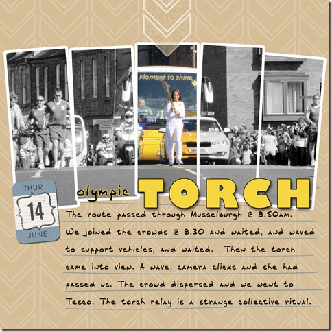
I saw this photo idea somewhere on blogland (sorry didn’t save link) and thought that the Olympic torch relay was a good subject where I wanted to highlight a section of the photo. Felt good to be making a layout for a change. I’ll be printing this 6 x 6 which is why the font looks big for a 12 x 12
Credits – I made the template. Paper is Audrey Neal’s Whiteout paper set from Design House digital; date is from Biograffitti (now retired)


4 comments:
Nice job. the shape really supports the theme. And nice photo.
Rinda
What a perfect way to highlight the torch part of the picture. I like this very much!
Love what you've done with the pic!
Alison xx
Love what you've done here....the torch passes through our town on July 17th....am hoping to get some photos.
Post a Comment