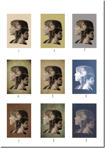
When I first saw this album cover from The Script I wanted to replicate it with my sister and her boys
So over Christmas I asked them all to pose and was surprised pleased that all three agreed. I took each portrait in front of a white wall and positioned them in the appropriate positions, using a printout of the album cover as a guide.
Then using the pixel magic of Photoshop Elements I extracted each head, adjusted the light, positioned them together and tidied it up. Much easier than I had feared, I think because of the white background and correct pose in the original photos (and I’ve used all these tools within PSE before).
As it turned out that was the easy bit. Then I showed it to the family and had suggestions of making it lighter / darker / black and white / with a colour behind. So I created another 8 versions
and each person has a different favourite so it looks like I’ll be ordering a series of different prints. But that’s the magic of digital images.
Which is your favourite – I’m sure we can find a backer for each of them !!


6 comments:
Helena, this is so clever. What a cool look. Not sure if I could choose one favourite, though number two is jumping out at me because I like the background colour.
Such a great idea! It took me awhile to pick a favorite, but I think it's #4. I like the vignette on the edges.
...and I like the texture in number 8. Well done, such great pieces of art.
You ARE clever Helena!
Alison xx
My favorite is #8. Don't know why but that caught my eye first.
Oh this is SO cool! I love it, Helena. I think I like the first one you posted best, but the others with different colors in the back are great too. You are so clever.
Post a Comment